How to make a multilayer network illustration isometric style
Jun 4, 2021
To sell complex concepts and ideas, the essence of scientific papers, it is essential to create appealing visualisations.
Academic publishing, in my view, is plagued by grotesque and unappealing illustrations. Authors include unappealing figures even though the figures are the first thing a readers sees when skimming. This first impression is crucial to retain a reader and to convince him or her about the quality and effort put into the work. A visually appealing and concise illustration of the central concepts, aka a cartoon or illustration, helps the reader.
I work a lot with network data and one recurring theme in network visualisations are multilayer networks1 and multiplex networks2. A natural way to represent these “layers” is through the metaphor of a plane in 3D space. Still, just like any other plot in 3D, the effect can look gimmicky or confuse the reader more than anything. Therefore it is essential to keep the 3D gimmick low-key while offering the reader an intuitive analogy to understand the concept.
A motivating example is a figure below.
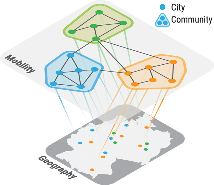
Here we see two layers, one representing geography and one representing communities. If you are interested in the illustration, you can check out the paper here.
I will describe how to generate a similar illustration using Adobe Illustrator (you can also use Affinity Designer).
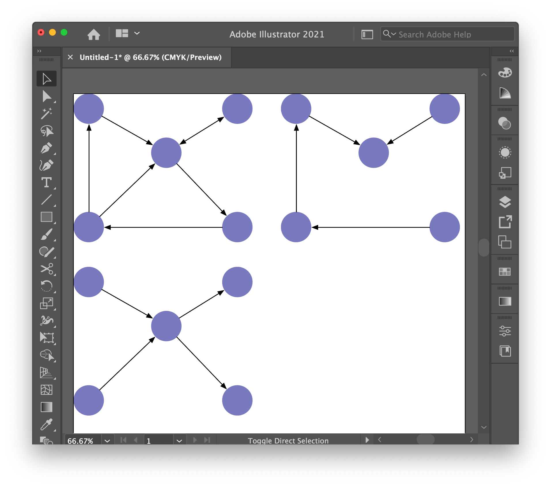
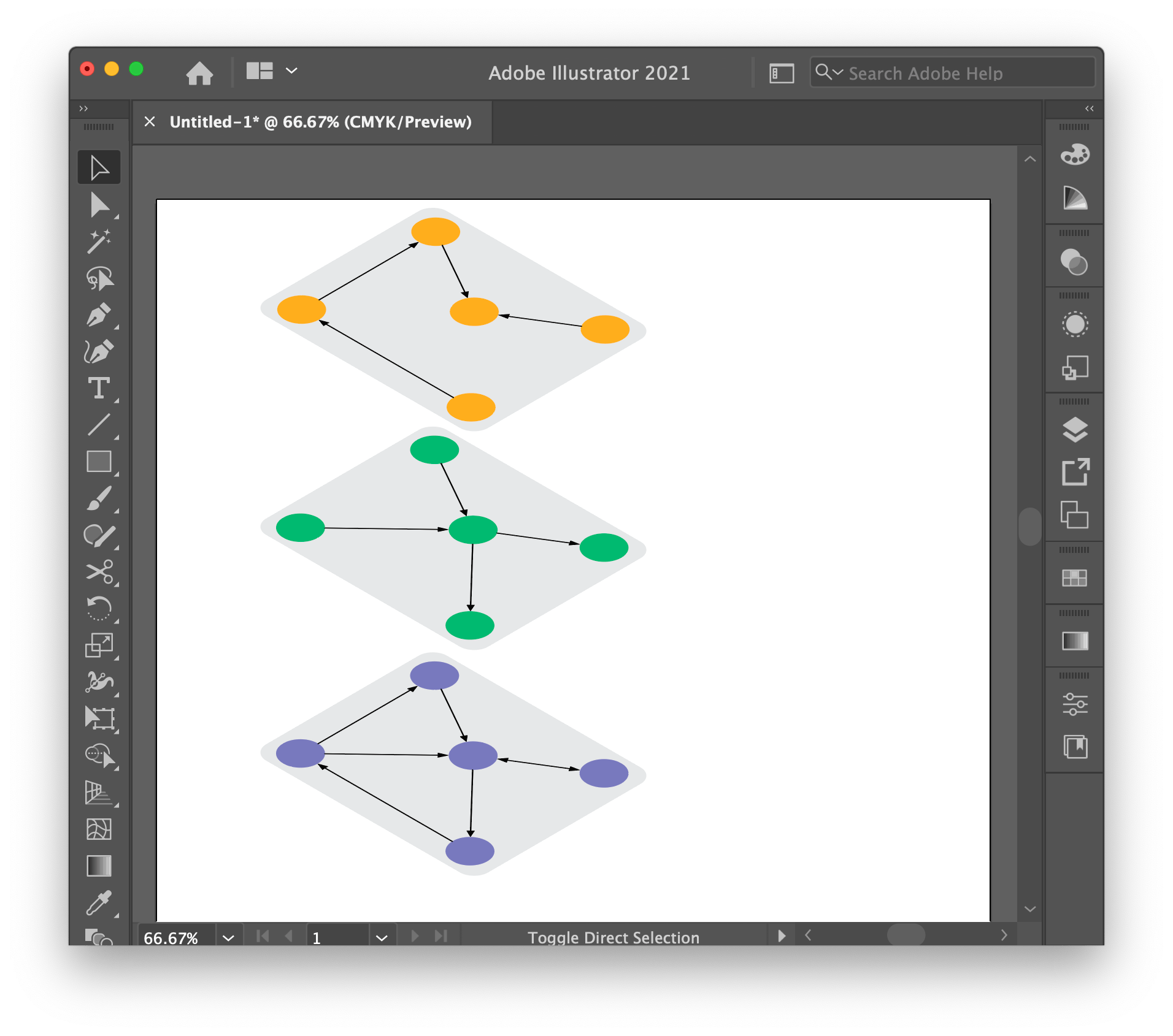
First, you should design the graphs you want to plot on the various layers.
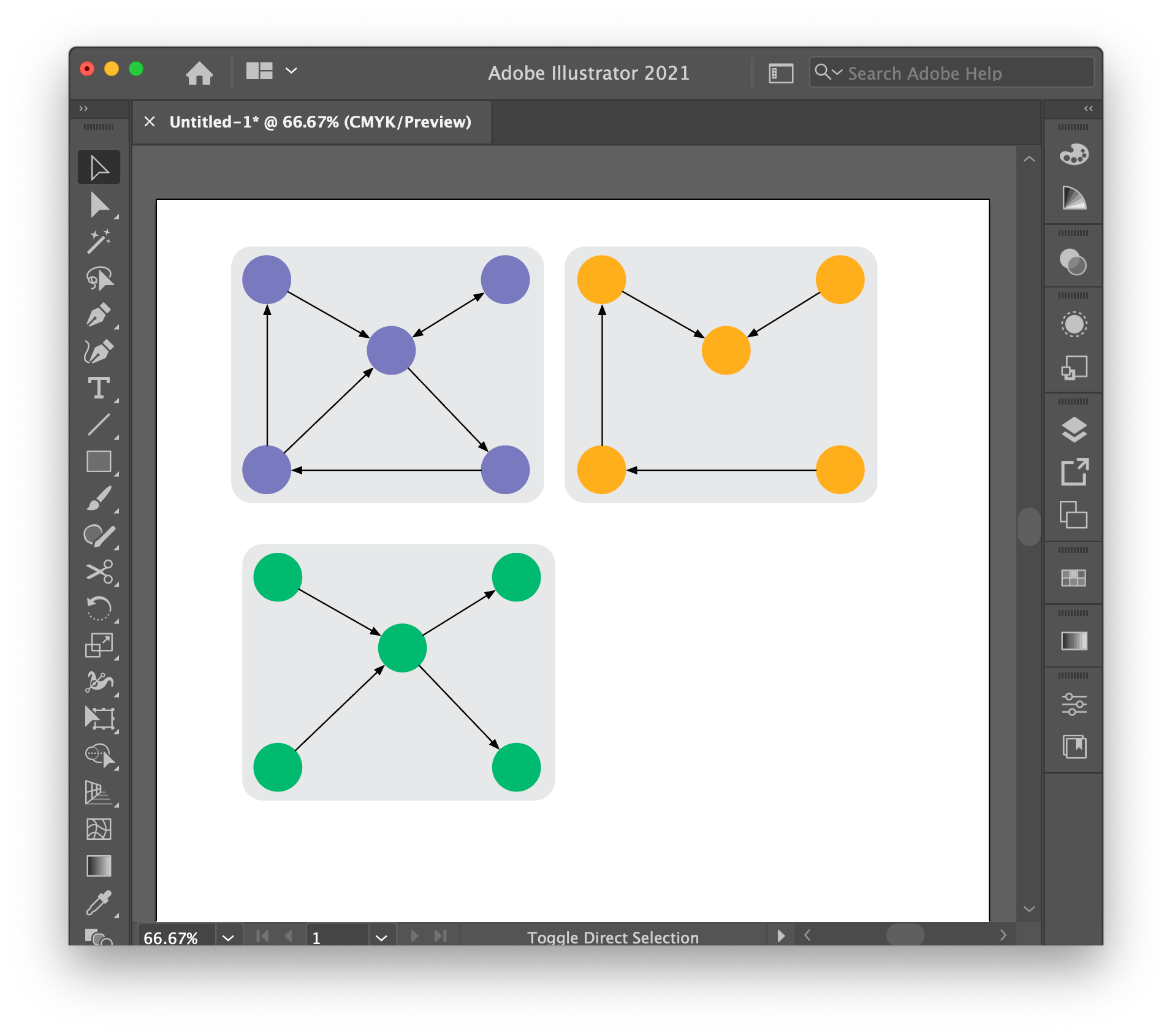
Then to sell the analogy of a “layer”, we a rectangle with rounded corners below the object and group each network with the respective rectangle (this step is necessary for the rotation later).
Now to the actual 3D effect, the isometric rotation.
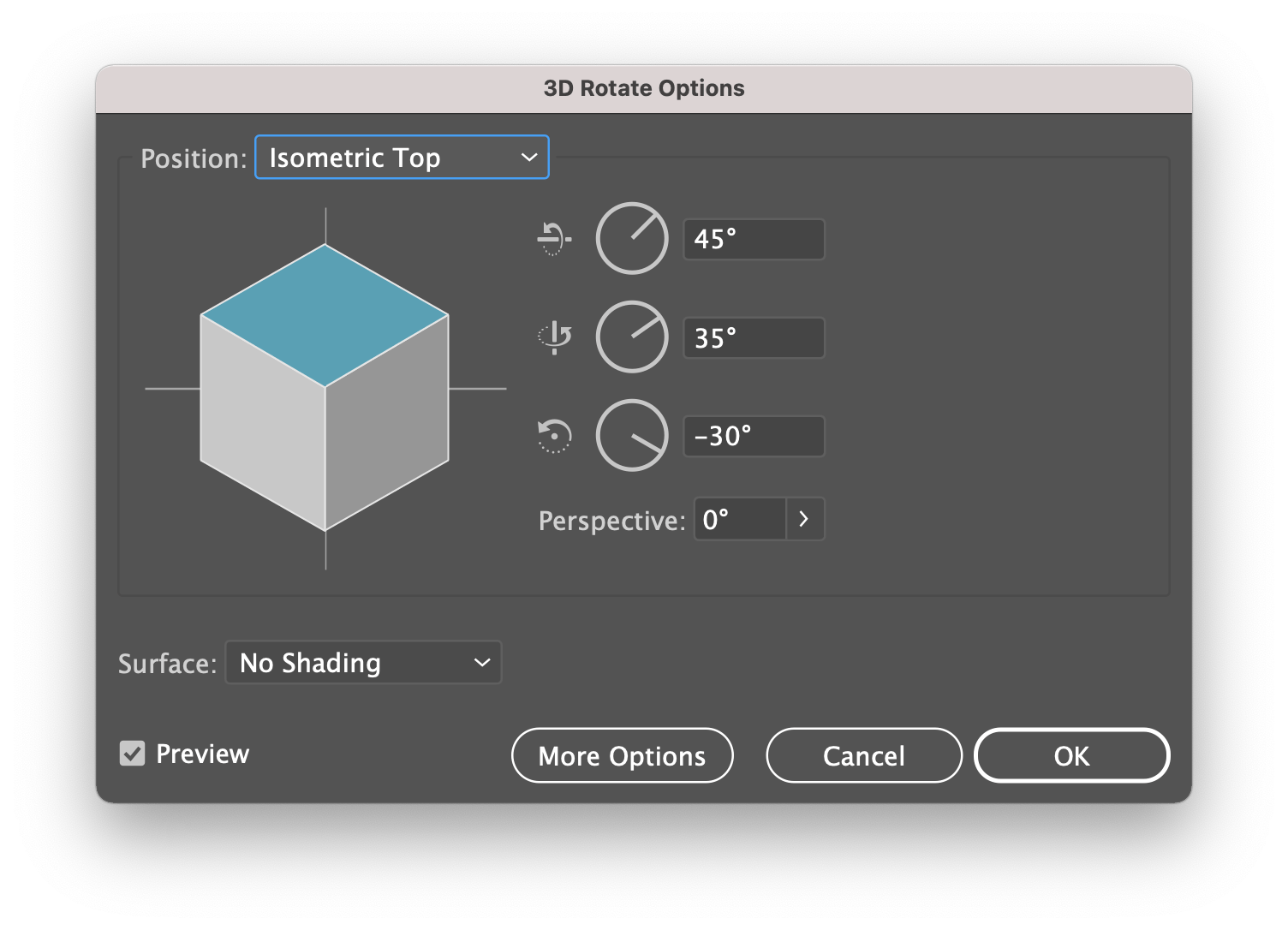
Choose from the menu Effects > 3D > Rotate.... You should see the window below.
Choose “Isometric Top” as the rotation and click OK.
You may use any other rotation, but the isometric projection is visually appealing and less distracting, all features we want in a good illustration.
Next, once the layers are rotated, align them vertically.
To drive the 3D effect home, slightly overlapping the corners helps trick the brain into believing the illustration has depth. We further enhance the effect by making the layer slight transparent. You can do this by changing the rectangle’s opacity.
![]()
Finally, repeat the same process with text, but you rotate it to “Isometric Right”, as in this case.
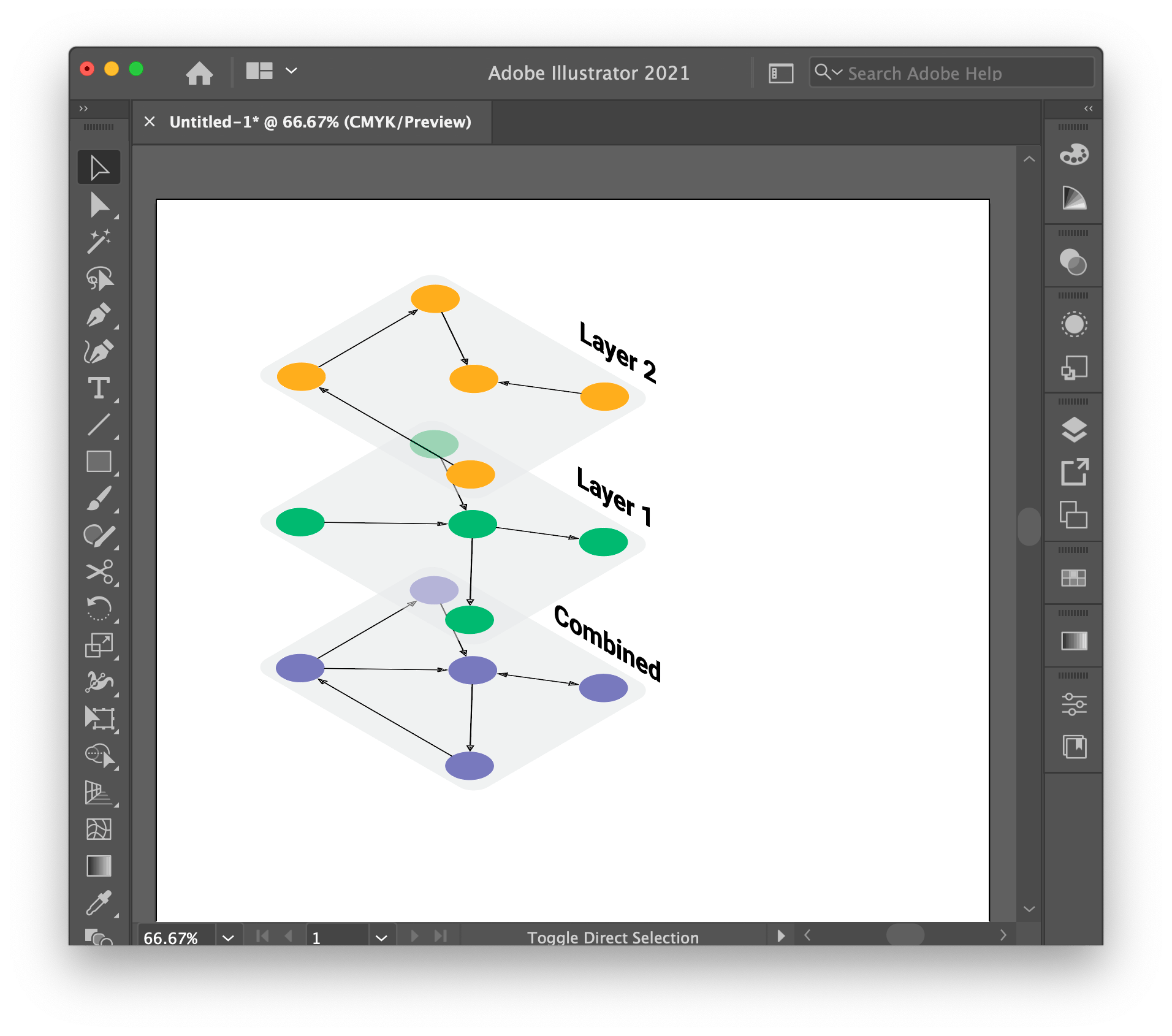
This gives us the following final result.
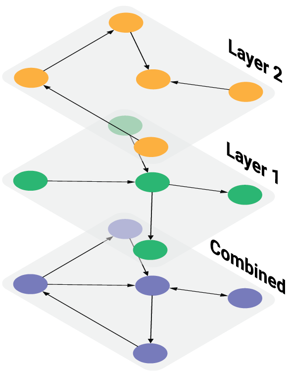
This is an elementary example, but the general idea can be used to great effect when illustrating multilayer networks.
Hope this helps
-
Multiple simple networks with the same nodes, but different relations, for example, multiple relationship types between students at uni, e.g., “are in the same class”, “are friends”, “romantic interest”, “personal nemesis”, etc. ↩︎
-
Like a multilayer network, BUT each layer may represent different entities, e.g., one layer author collaborations, one layer their institutions and one layer the paper and their citations. They are all interlinked but represent different relations. ↩︎